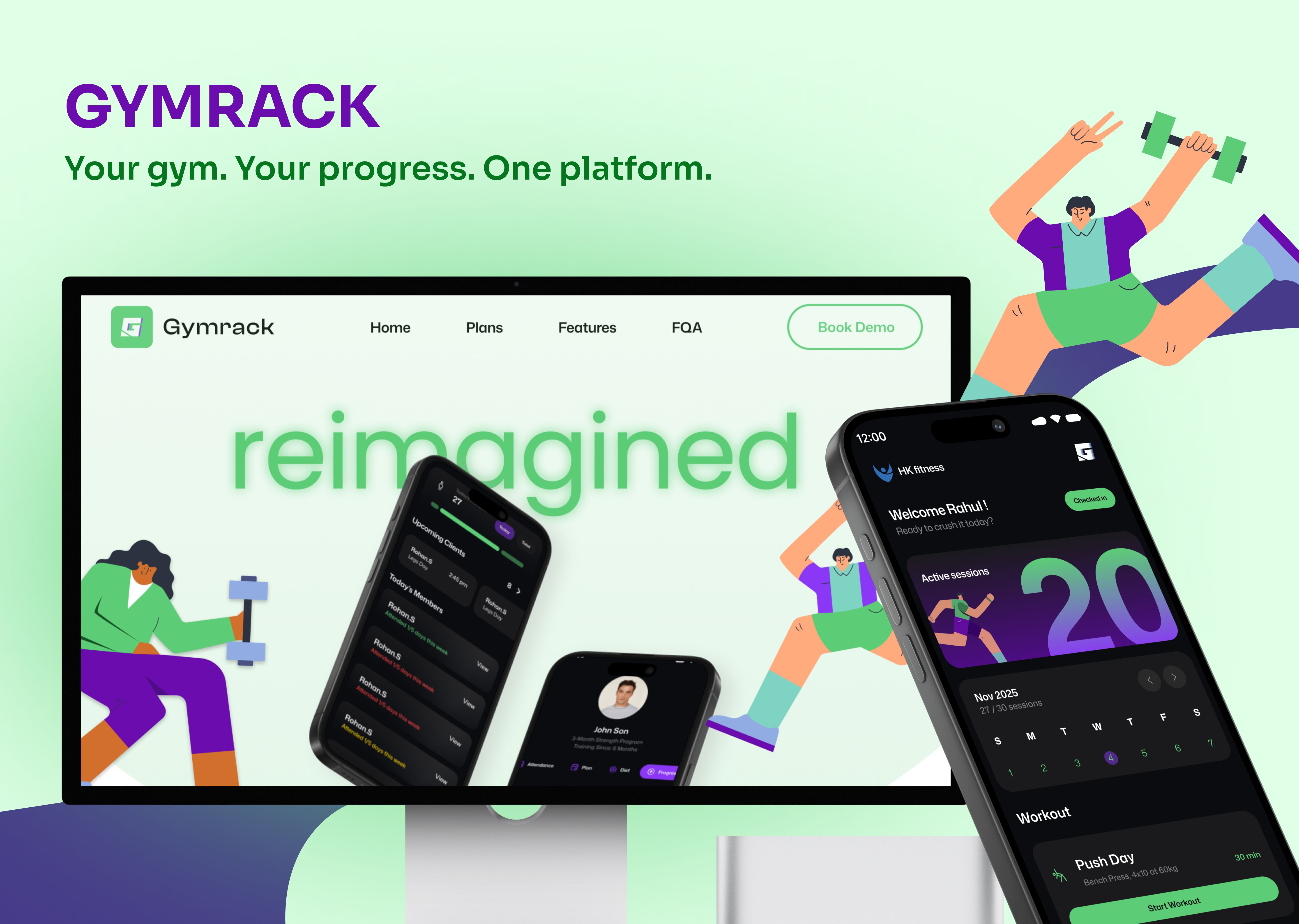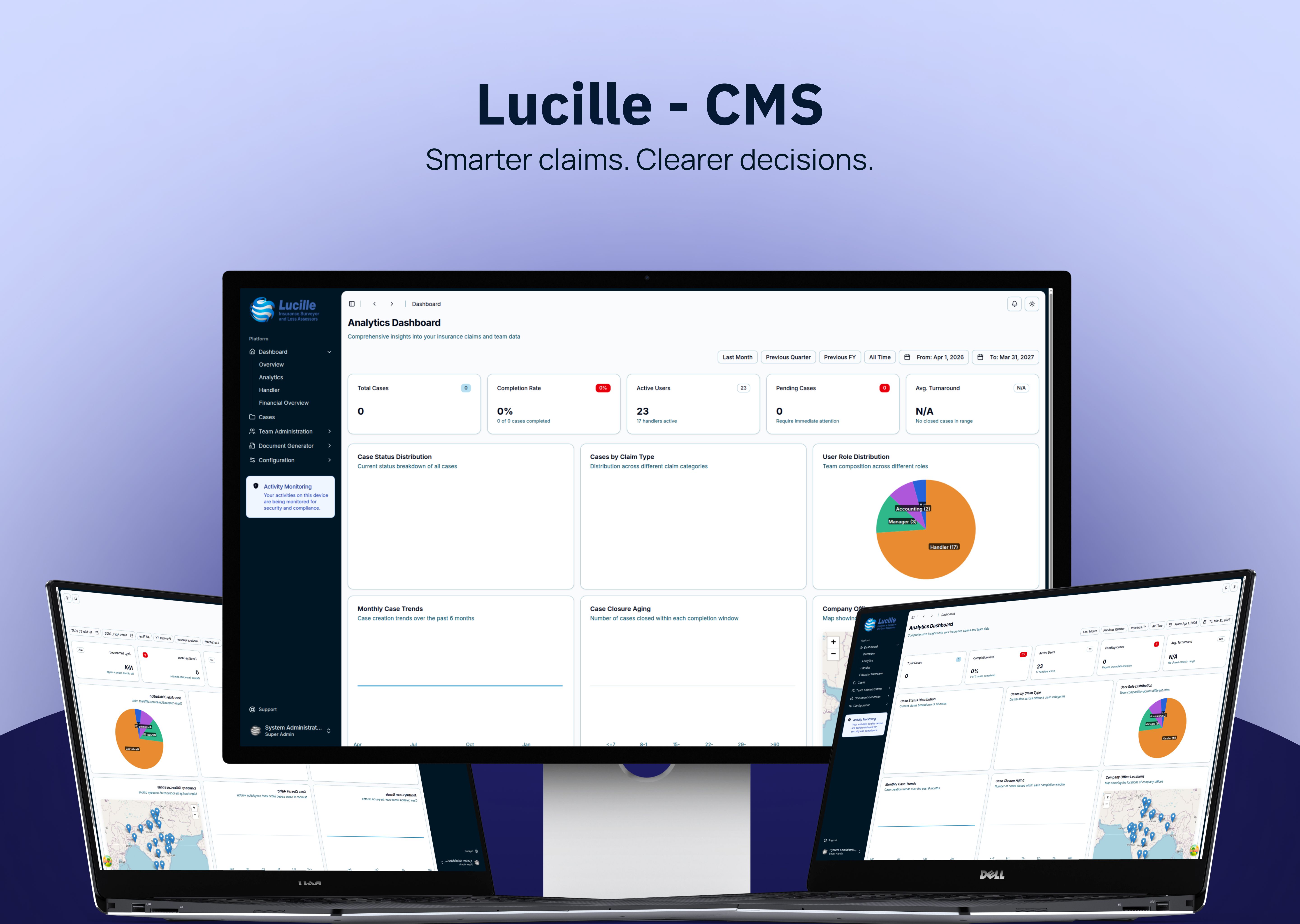

A client-provided Figma design becomes a strong website only when the production implementation preserves its visual system under real conditions. SvelteKit provides the front-end structure and Tailwind CSS keeps the layout, type, spacing, surfaces and states precise enough to reproduce the approved design without turning the code into a pile of exceptions.
Who This Is For
- Clients that already have a detailed Figma design and need expert front-end delivery.
- Design teams that want their visual system reproduced accurately across a complete page set.
- Technology and gaming brands with interaction, animation or dark-mode requirements.
- Teams that need the implementation to stay maintainable after the first launch.
Read the Figma as a System
The handoff is more than a set of screenshots. It contains a visual language: typography, spacing, assets, grids, component states, responsive examples, motion intent and content assumptions. The developer's job is to identify those rules and turn them into something the browser can render consistently.
Build the Visual System in SvelteKit
SvelteKit gives the project a clear route and component structure. Shared navigation, buttons, cards, media blocks and content sections can be implemented once, then composed into the distinct pages described by the design. That is how a multi-page site stays consistent without flattening every page into the same layout.
The important test is whether the system supports real text, real images and real interaction states. If a component only works with the exact copy shown in Figma, it has not been translated into a production rule yet.
Use Tailwind CSS to Replicate the Design
Tailwind CSS is useful when the implementation needs direct control over spacing, typography, colour, borders, layout and responsive variants. The visual decisions stay close to the component, making comparison against the Figma source faster and making future adjustments less mysterious.
Exact replication still requires judgement. A design file cannot show every possible title length, screen width or input state, so the implementation has to preserve the intended hierarchy while adding sensible rules for the cases the mockup did not show.
Prove the Result Across Devices
A pixel-accurate desktop screenshot is only one checkpoint. The finished site needs comparisons across desktop, tablet and mobile widths, plus keyboard focus, touch targets, long content, image loading and reduced-motion behavior.
This is where responsive engineering protects the design. The site can stay faithful to the Figma intent while adapting the composition for screens and content that were never included in the original handoff.
Keep 100% Visual Fidelity Maintainable
The strongest implementation treats 100% Figma replication as a quality bar for the visual system, not as permission to hard-code every screen. Reusable SvelteKit components, Tailwind CSS utilities, clear content boundaries and deliberate responsive rules keep the result accurate and changeable at the same time.
Case in Point
In one client-led design-to-production build, Stacknyu used SvelteKit and Tailwind CSS to reproduce an intricate Figma system across seven page types, interactive UI and a gaming-server dark mode. Read the portfolio case study for the implementation context.
Frequently Asked Questions
Why use SvelteKit for a Figma-based website?
SvelteKit gives the front end a clear component, route and rendering structure while keeping the implementation fast and responsive. It is a strong fit when a client expects a visually exact multi-page website that still needs real content and maintainable interaction.
Why use Tailwind CSS for pixel-perfect implementation?
Tailwind CSS keeps layout, spacing, typography, colour and responsive variants close to the components that use them. That makes the visual comparison loop faster while still allowing the design system to be reused across pages.
Can a Figma-accurate website still be responsive?
Yes. Accuracy means preserving the visual intent across supported sizes, not freezing one screenshot. Flexible layout rules, content-aware components and real-device testing let the design adapt without losing its hierarchy.
When does a Figma handoff need expert front-end implementation?
It needs an experienced front-end team when the design has multiple page types, complex interaction, animation, dark mode, responsive states or a high bar for visual fidelity. The hard part is preserving the design while making it behave like a real product.